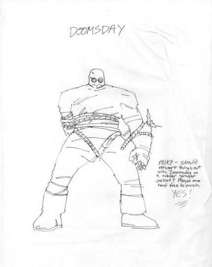
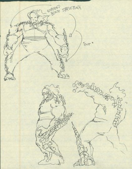
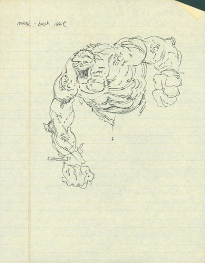
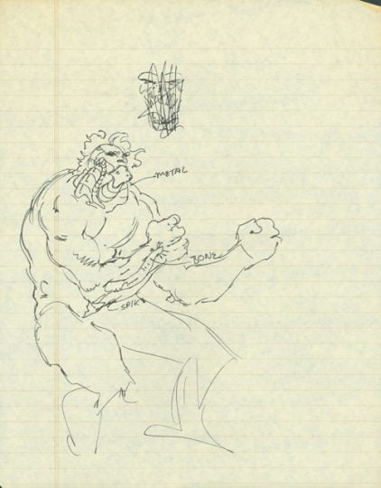
When we first started talking about Doomsday, he didn’t even have a name. We talked about him in terms of “living rage” or “force of nature”. These first three sketches were actually done during the meeting where Doomsday and the Death of Superman were planned. We knew he’d be big, violent and forceful. In the first sketch, you can see he has some metallic portions showing, which wasn’t the look we wanted! The second sketch shows more rage and gives a hint of what Doomsday would eventually become.
Once the second sketch was done, I knew which direction I wanted to go in. Sketch three shows Doomsday with more bulk and mass than the original attempts. The hair and exterior skeletal features were there. Notice that on Doomsday’s leg, the exterior bones are on the side of the leg rather than the front, where they would eventually go. Once I got back to the studio I used that general look to work up the final design for Doomsday, as shown in sketch four. The wide shoulder bones still weren’t quite a part of it!
Of course, when Doomsday first appeared in print, he was hidden away in his rubber suit. We wanted a straight jacket sort of appearance, something that would mask the monster a bit and make the ultimate revelation more dramatic! You’ll see a note written to then-Superman editor Mike Carlin, where I ask about the rubber suit, as well as Mike’s enthusiastic response!


